
In 1942, with paper rationed across a country at war, the British government looked at a casting directory and decided it was essential to the national effort. Spotlight — a book of actors' faces — was granted an exemption so it could keep printing. Morale needed entertainment, entertainment needed casting, and casting needed the book.
That detail tells you what Spotlight was. Not a website with a heritage page. An object the state classed alongside necessities.
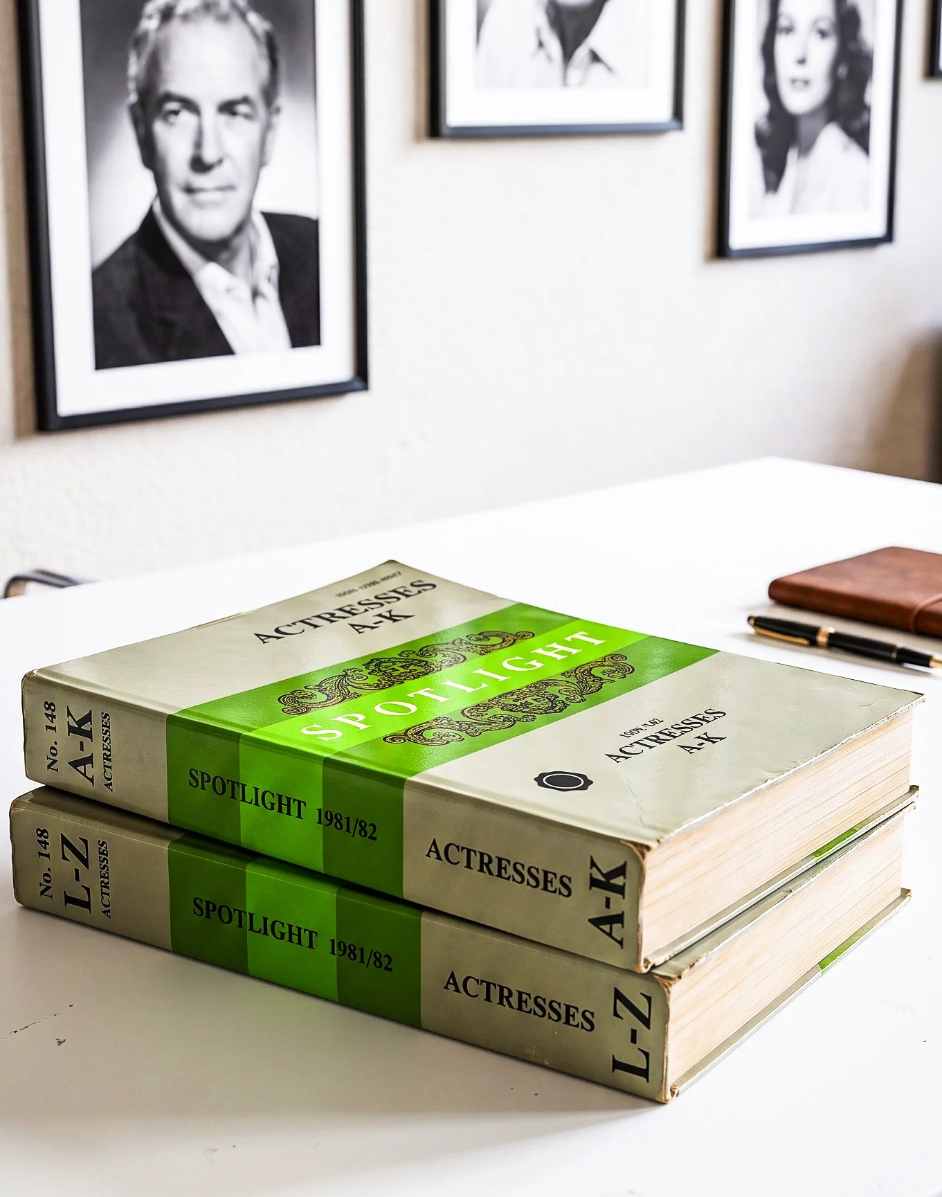
IIt began in 1927, when a stage manager named Keith Moss got tired of watching the same problem repeat itself: directors couldn't find actors, and actors were hauling photographs around London by hand. His solution was a directory. The first edition contained 236 performers and two dogs. Within a decade or so, under managing director Rodney Millington, it was the standard casting reference for British film, television and theatre — the book the industry itself came to call the casting bible.
And here is the part that sounds invented but isn't: that book, or rather that shelf of books, stayed in print until 2017.
A phone book of faces
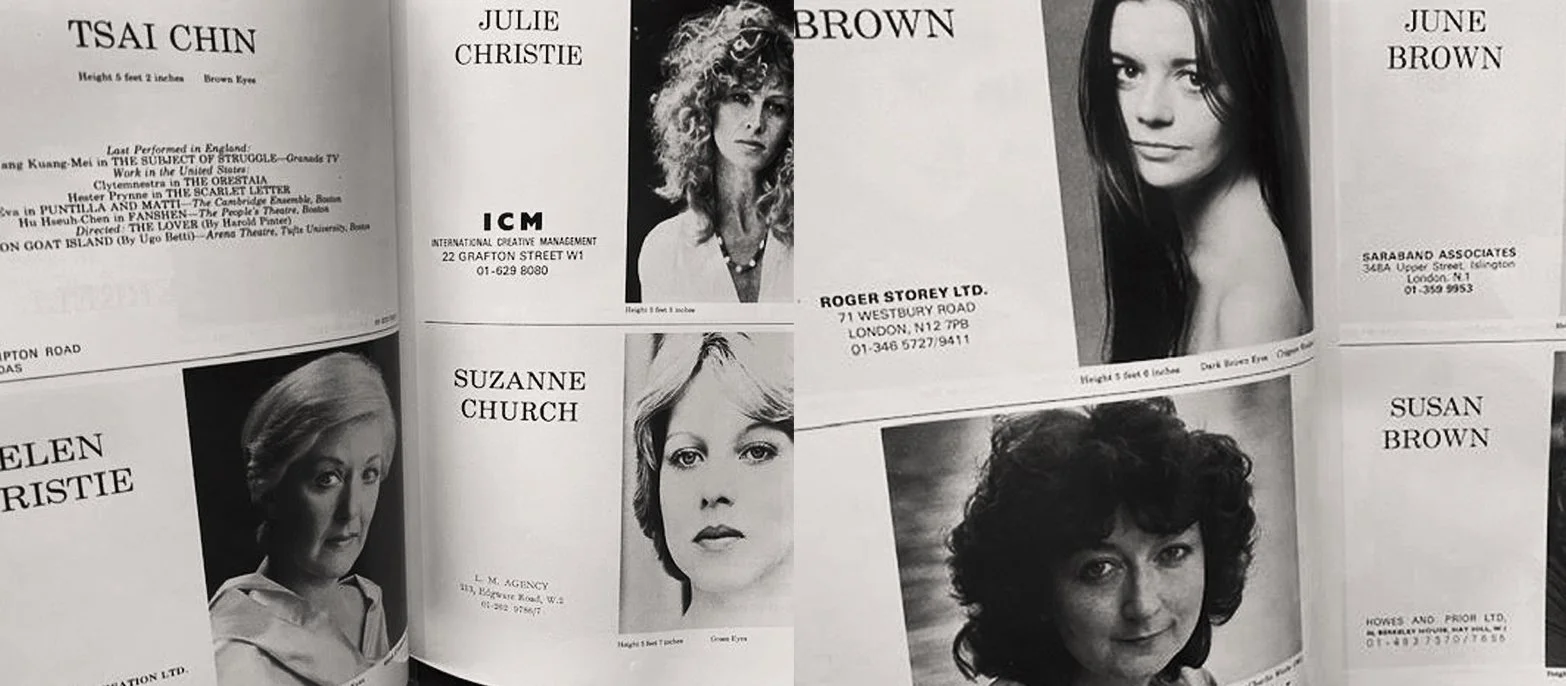
If you never saw the Spotlight books, imagine the Yellow Pages, but every entry is a face. Black and white portraits, printed above the performer's name and their agent's details, page after page after page.
The taxonomy was the strangest part. There were separate volumes for Actors and Actresses — men in one set of books, women in another — and within those, performers were filed by type. A 1993 edition sits in the Victoria and Albert Museum's collection today as part of an artist's project, and the volume titles read like a filing system for human beings: Leading Actors N–Z. Character Actresses A–K. British theatre had literally sorted its people by gender, alphabet and category, the way a plumber's merchant sorts washers.
There were further directories for Children and Young Performers, for Graduates, for Presenters, Dancers and Stunts. By its final years the combined edition reportedly ran to something like fifteen thousand pages. Casting offices gave it shelf space the way law firms gave shelf space to statute books, and for the same reason. It was the record. If you were in the book, you existed. If you weren't, you didn't.
The decision nobody made
Every photograph in those books was black and white. Every one, for ninety years.
I have gone looking for the moment somebody at Spotlight decided this, some memo or editorial statement about the purity of monochrome. It doesn't appear to exist, and I've come to believe that's the whole point. Nobody decided it. In 1927 there was no choice to make — colour reproduction barely existed as a commercial option. And once the format was set, the economics kept it set. Printing tens of thousands of halftone portraits annually, across multiple volumes, on directory-grade paper, is a serious industrial undertaking in one ink. In four inks, with colour plates and the impossible job of keeping skin tones consistent across cheap stock and enormous print runs, it stops being a directory and becomes a vanity project. Black and white wasn't an aesthetic. It was a production constraint.
But constraints have a way of dressing themselves up as philosophy. Because the book was black and white, actors needed black and white prints, so photographers shot and lit for black and white, so a whole visual language grew up around it — the moody contrast, the sculpted shadow, the theory that monochrome strips away distraction and shows you the soul. It's about the eyes, people said. A generation of British actors believed their headshots were black and white for artistic reasons. They were black and white because of what a printing press could economically do.
You can test this claim, because history ran the experiment for us.
The twenty-year afterlife
Spotlight put out a CD-ROM in 1995 and went online in 1997. By any rational account, the book should have died around 2000. It didn't. It kept printing for another twenty years, black and white to the last, while the website quietly became the place where casting actually happened.
Why the book survived so long is the one question my research couldn't fully settle, so I'll tell you what I think rather than pretend to know. Part of it was the generation of casting directors who had spent thirty years thinking with their thumbs, flipping pages. Part of it was ritual: your page in the book was annual, physical proof of your membership of the profession, in a way a database row never quite is. And part of it, I suspect, was that the book had become furniture — the visible spine of the industry, sitting in reception, saying this office does serious casting. Institutions keep printing their own monuments long after anyone reads them.
But while the book idled, the website did something the book never could. It accepted colour.
Through the late 2000s, colour headshots started appearing on Spotlight profiles, and the reaction is worth recording, because people now forget how strong it was. Actors who trained in the early 2000s have written about the low-level horror of it — colour felt like sacrilege, a category error, the sort of thing that marked you as someone who didn't understand the business. Spotlight itself hedged, at one stage suggesting members upload half their photographs in colour and half in black and white. The Americans, meanwhile, had been in colour for years and found the whole British debate baffling.
Then, in the space of maybe five years — roughly 2010 to 2015 — the sacrilege became the standard. Casting had moved to screens, screens are colour, and colour is information: hair, eyes, skin, the things a casting director actually needs to know before calling you in. The ninety-year aesthetic didn't fade gracefully. It collapsed. By the time the final printed volumes appeared in 2017, still monochrome, they were a museum piece of their own convention. Today, leading with a black and white headshot on Spotlight would read as eccentric.
That collapse is the proof. If black and white had genuinely been the better way to show an actor's face, it would have survived the death of the printing press that required it. It survived about as long as a rumour.
What I take from this
I started photographing actors in 2006, at the tail end of the book era, and I trained as a cinematographer before that, so I have spent my working life on both sides of this question — in love with what monochrome can do, and clear-eyed about what it was actually for.
Here is where I've landed. Colour is now the honest default, because a casting headshot is a factual document and colour carries facts. But black and white didn't become worthless when the book died — it became a choice. And a choice is a different thing from a default. When I convert a portrait to black and white now, it's because something specific in the face — a structure, a quality of attention — genuinely reads better without colour, not because a printer in 1927 couldn't afford the ink. The photograph of yours that ends up monochrome will be monochrome for a reason I can point to.
Ninety years of British actors were photographed inside a constraint so old that everyone mistook it for a tradition. The least we can do, now the constraint is gone, is mean it when we choose the look